JOURNEY GROUP OFFICE
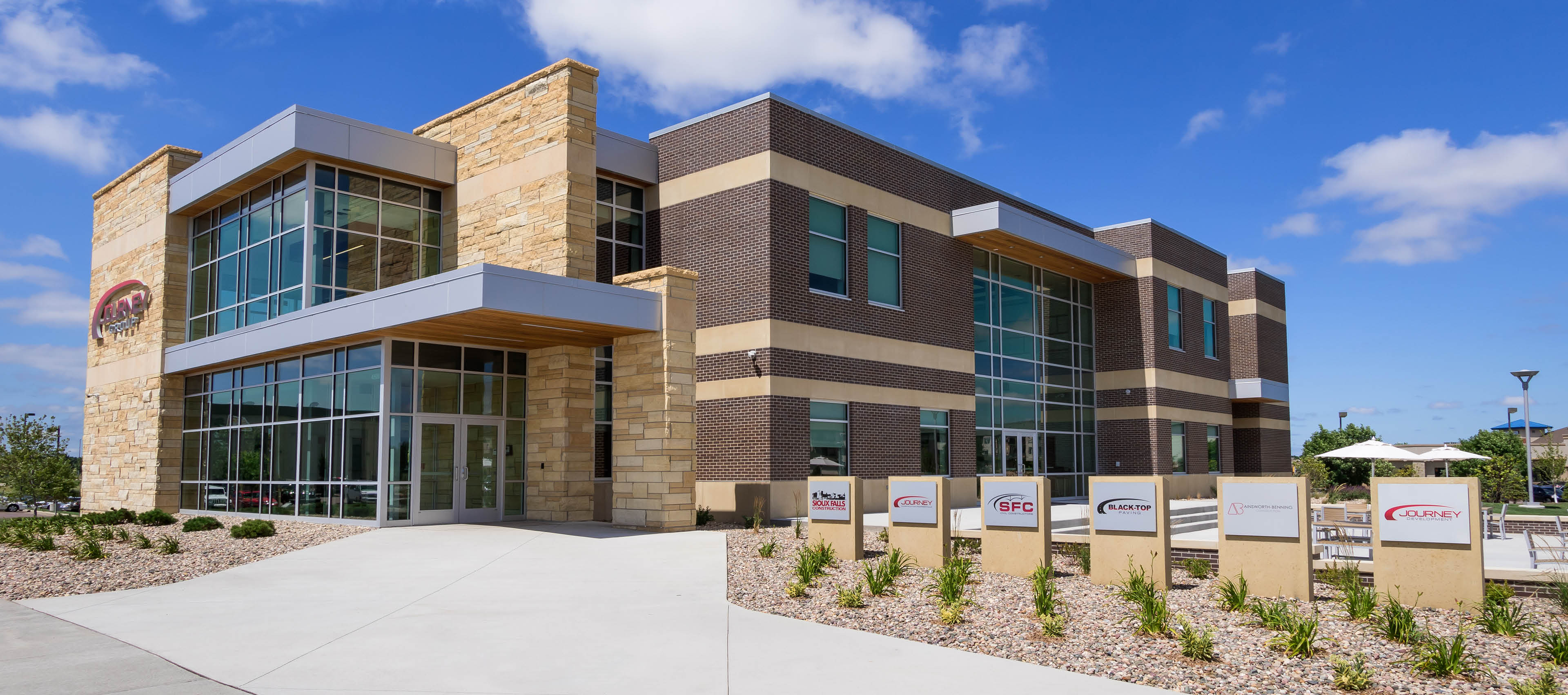
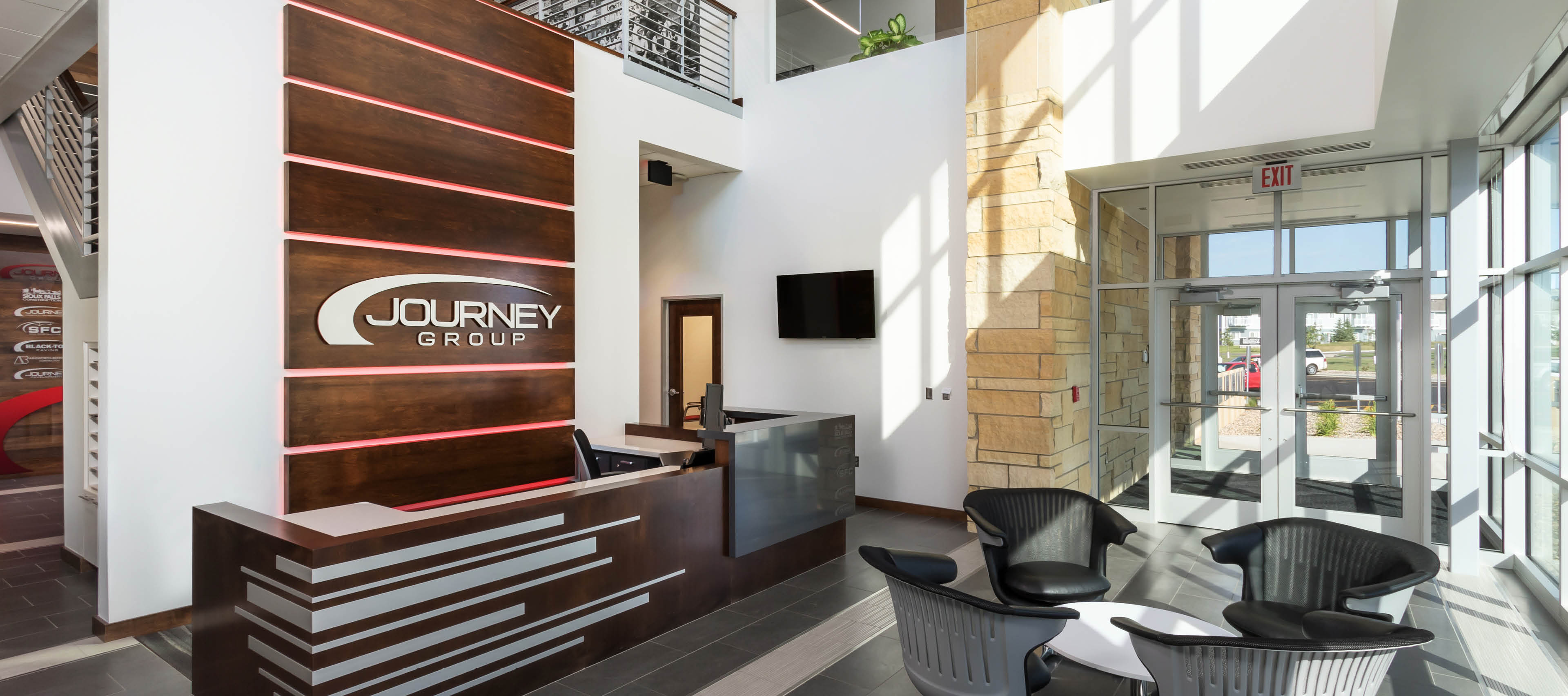
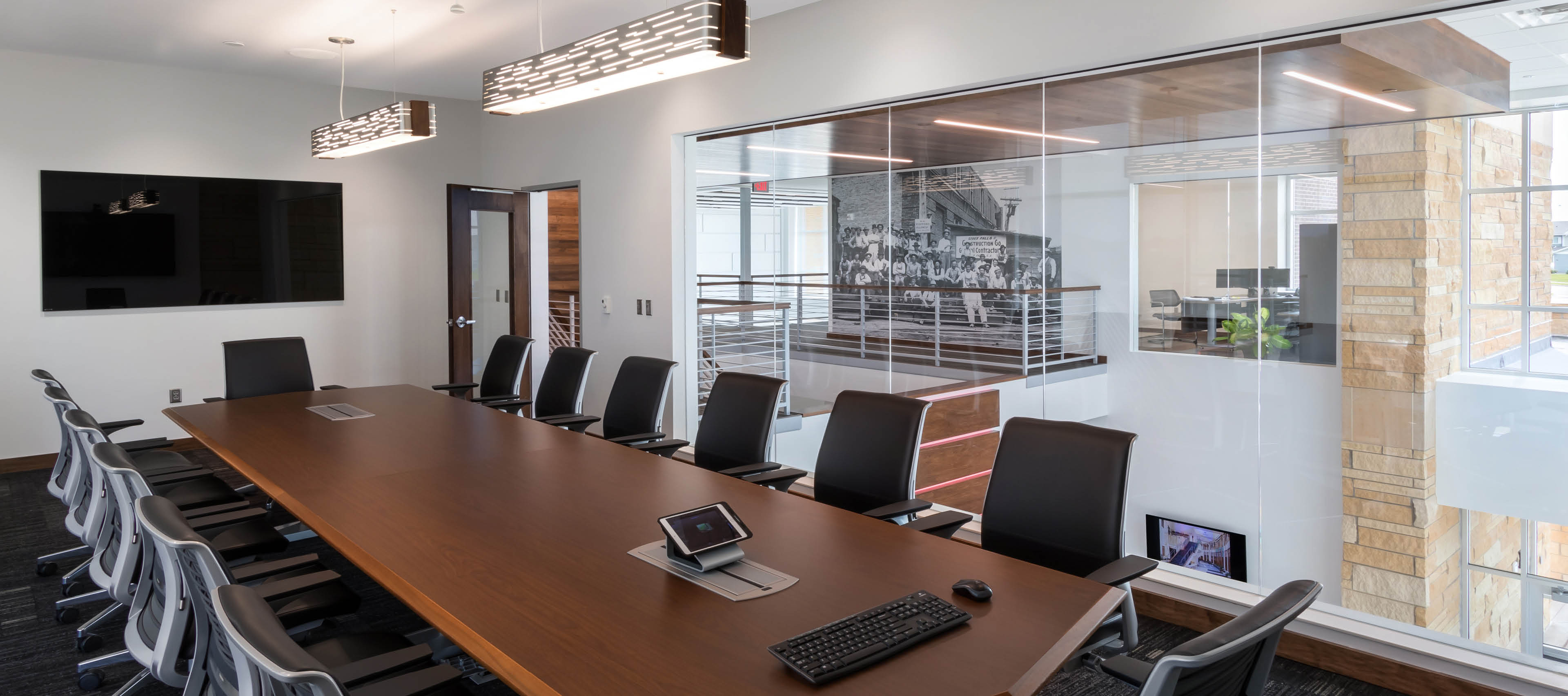
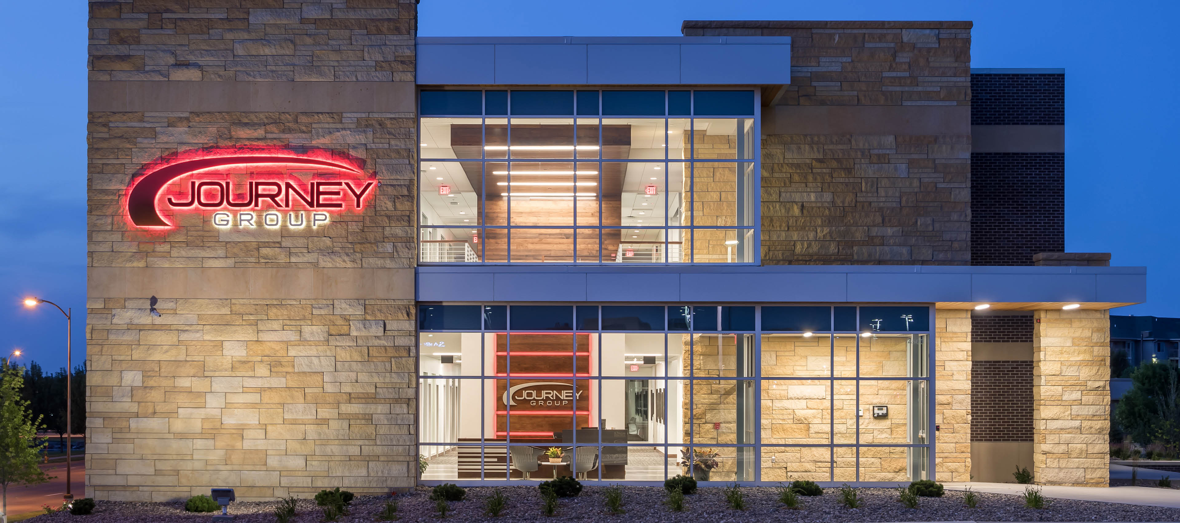
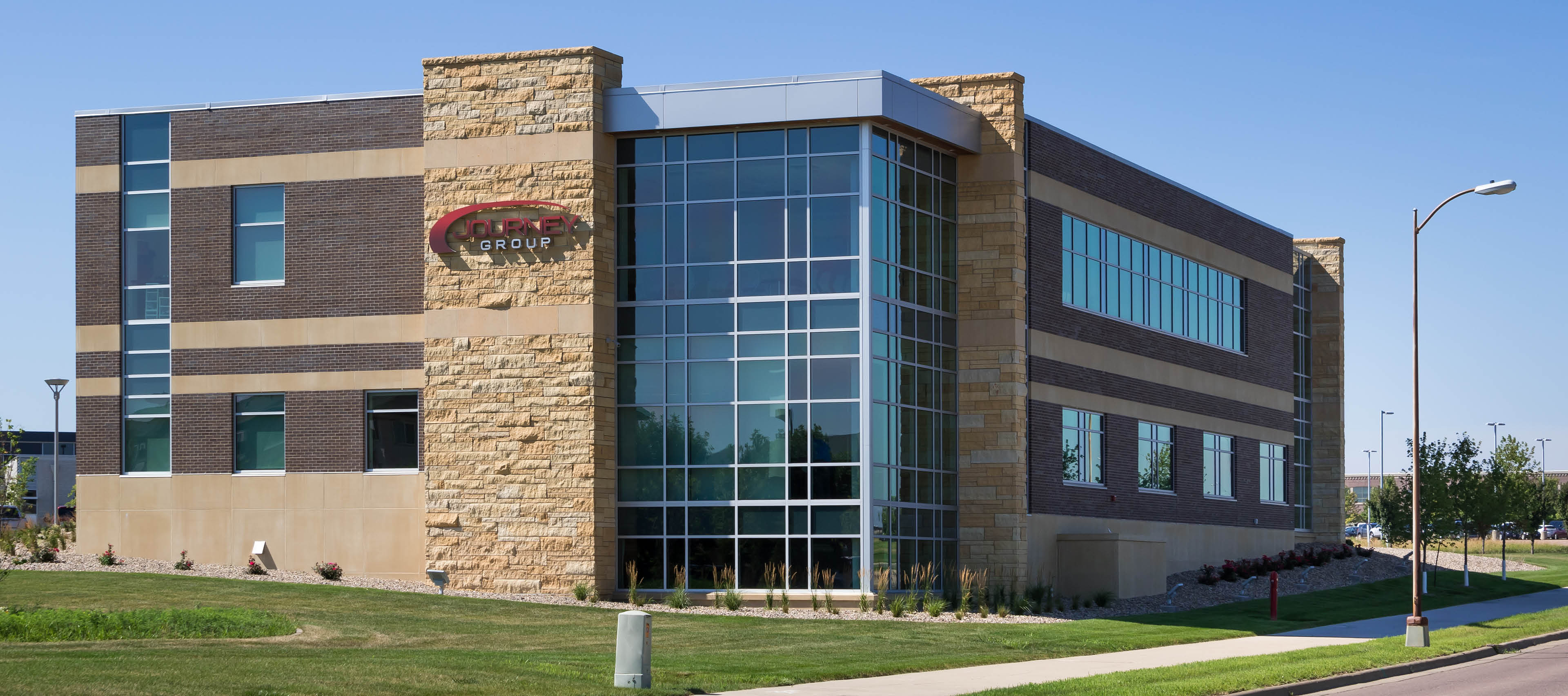
Journey Group, a construction company, wanted an office building that changed the way staff worked together, gave them room to expand, and showcased the quality of work their clients expect. They wanted a progressive space that also reflects that they are an established, solid company with a rich history. This was achieved through the use of metal and glass, and stone and brick masonry on the exterior and interior spaces. A large wood feature wall in the main lobby highlights the workers’ abilities and craftsmanship with the material. Historic photo murals were incorporated into the interior design as a reflection of the company’s roots.
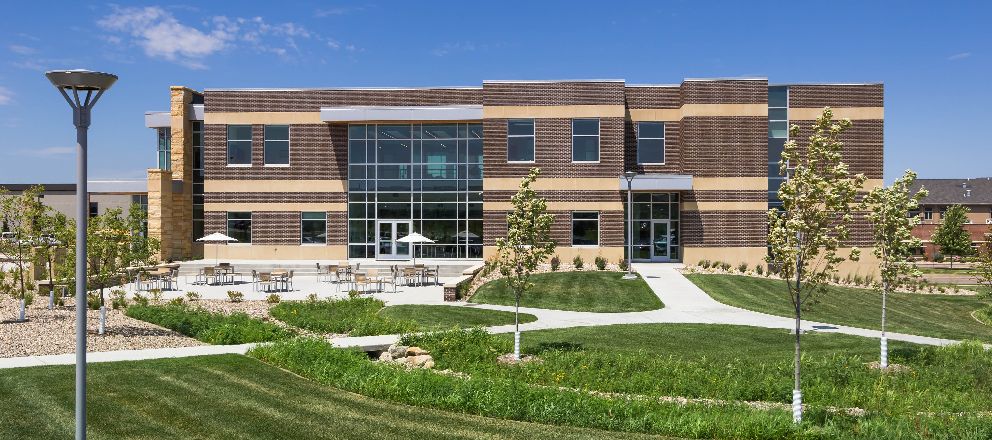
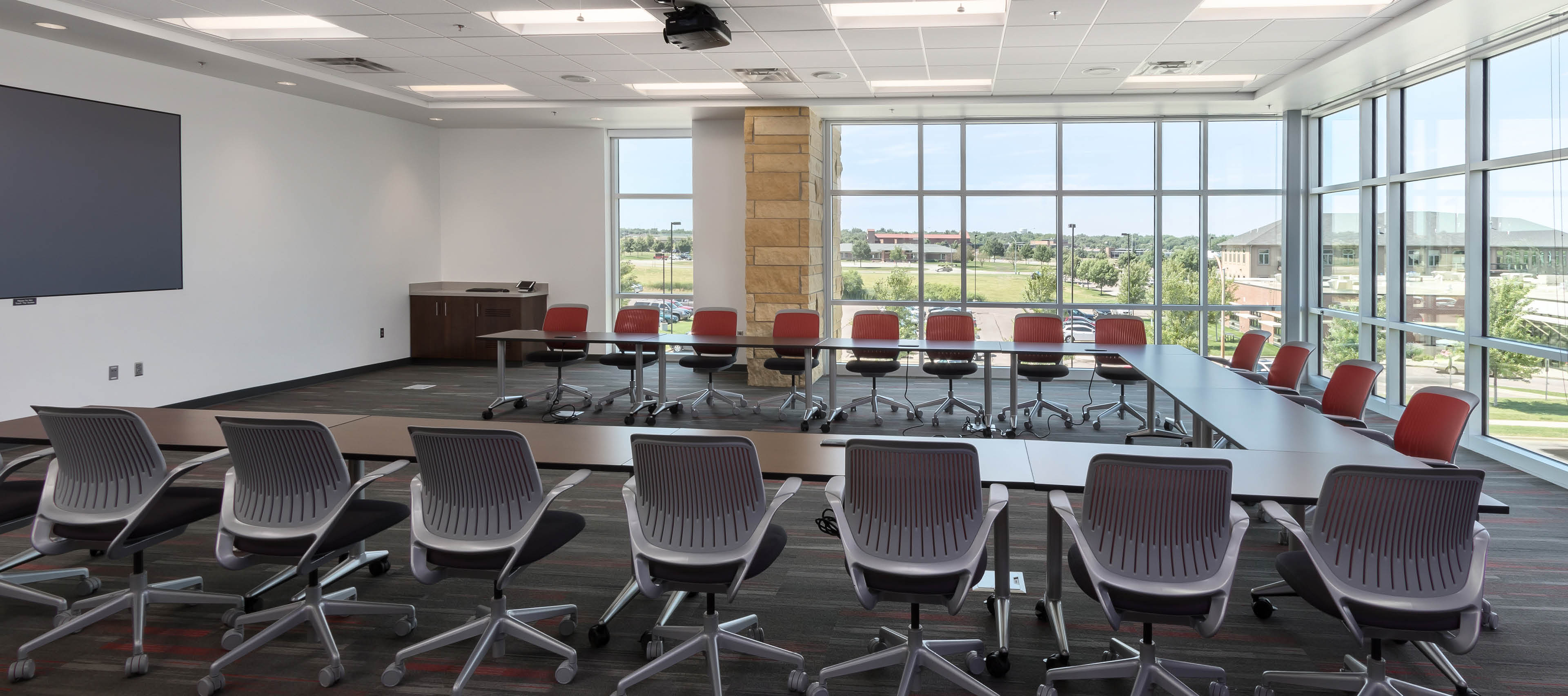
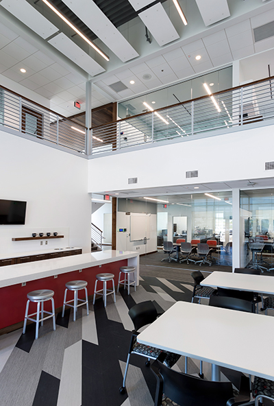
The client’s former building was a maze of winding corridors that lacked proper meeting and training spaces. Completed in late 2015, the new 20,000-square-foot, two-story building includes two large training rooms, conference rooms, informal collaboration spaces, and a large central hub. The training rooms are designed for flexible use, seating 40 people at tables or up to 150 people in chairs, allowing for large training sessions to take place in the company’s headquarters. The central hub serves as a large gathering space, a lunch room, and a connection to the outdoor patio. Offices were arranged so that Journey Group’s divisions are grouped separately. Strong visual and physical connections provides an office environment that encourages collaboration to make the company function as one large team.
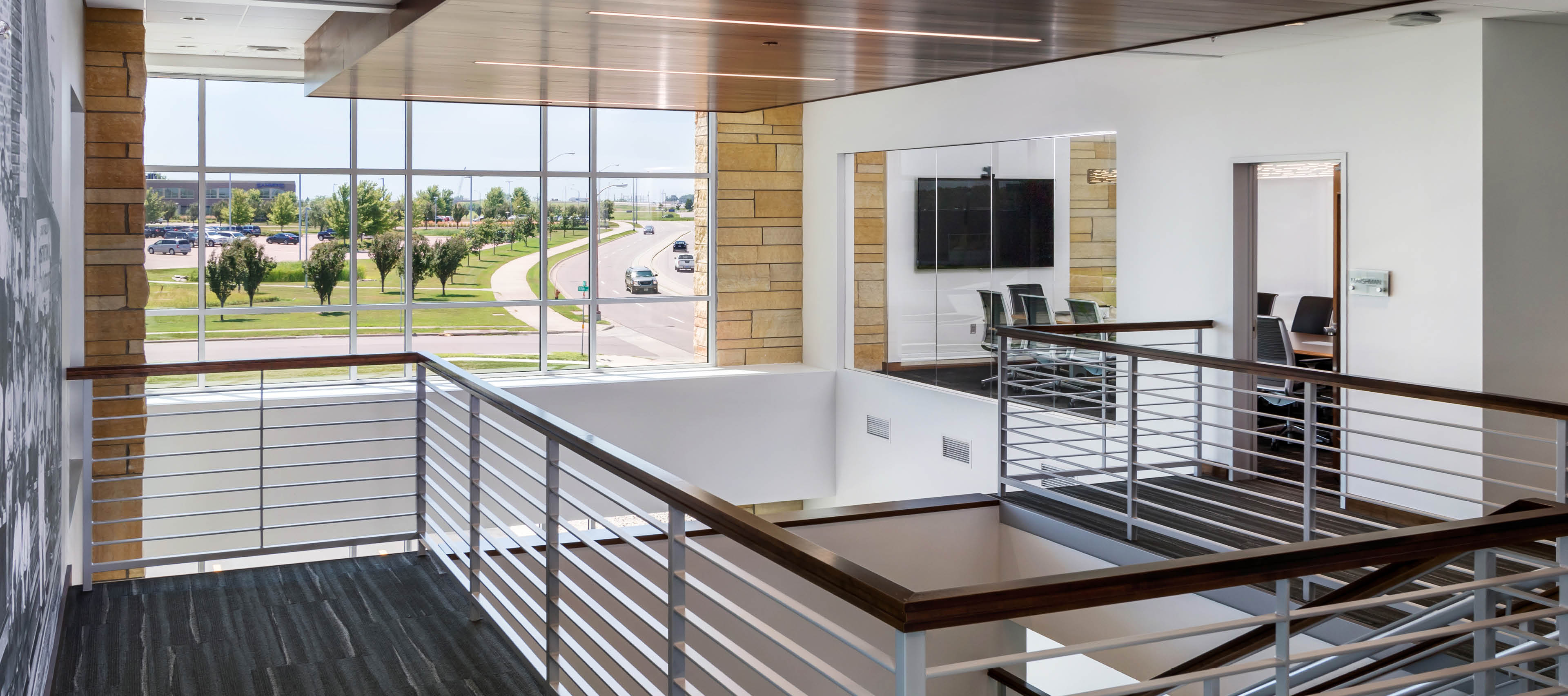
Visual connection was a top priority in the new $4.3 million building, but not at the expense of acoustical quality and privacy. A major design challenge was to maintain strong visual connections without creating a perceived hierarchy or division. This was achieved by creating two-story volumes in the lobby and central hub. Large windows or glass walls in the conference and collaboration rooms visually connect the spaces with the rest of the building. Locating a training room on the second level also helped to create opportunities for staff to interact.
The entire building is very transparent and incorporates an ample amount of natural light. The site was designed to accommodate future expansion of the company. The patio was located off the central hub to connect the interior and exterior spaces and create a buffer from the parking lot. The water feature was incorporated into the landscape to aid in water drainage and retention.
Size:
20,000 sq. ft.
Location:
Sioux Falls, South Dakota [View Map]
Completion Date:
2016
Project Cost:
$4.3 million

